Simply You offers personal style, colour, and image consulting services. They focus on helping individuals enhance their personal and professional appearance through tailored advice on wardrobe, colour analysis, and style development.
Simply You aims to boost clients’ confidence by providing personalised guidance that aligns with their unique personalities and lifestyles. Their services cater to both individuals and corporate clients seeking to refine their personal or business image.
Our creative process behind the logo design and WordPress website development for simplyyou.org.uk is an ideal example of Studio Savage & Gray’s creativity, strategic thinking, and technical expertise. In this case study we highlight the key stages and decisions that brought SimplyYou’s brand vision to life.
Understanding SimplyYou.co.uk’s Vision
The first stage is to understanding SimplyYou’s brand identity, target audience, and business goals. simplyyou.org.uk, a brand focused on delivering personalised lifestyle products and consultancy, required a digital presence that would communicate expertise, trust, style and elegance. The design process started with a discovery phase, involving consultations and workshops to align on the brand’s core values and desired perception in the marketplace.
Logo Design: Crafting the Visual Identity
1. Research and Concept Development:
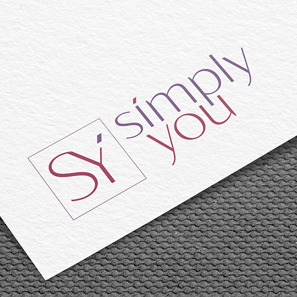
The logo design process began with an extensive research phase. Savage and Gray explored the industry landscape, analysed competitor branding, and gathered inspiration from various design trends. The goal was to create a logo that would be distinctive yet align with SimplyYou’s brand mission.
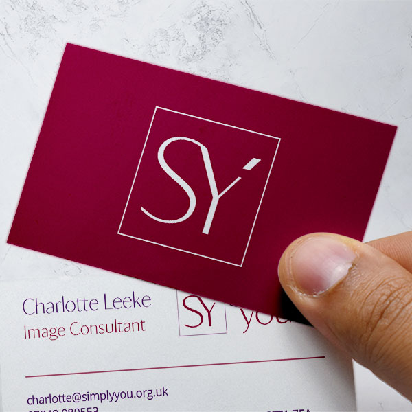
Savage and Gray presented several logo concepts to SimplyYou, each with a unique approach. This development was a critical part of the process, allowing the team to refine and adjust the designs. The chosen concept was a minimalist logo featuring clean lines and modern typography, encapsulating the essence of the brand. The colour palette was carefully selected to convey warmth and , using soft, inviting tones that would appeal to the target audience.
3. Finalisation and Brand Guidelines:
Once the logo design was finalised, we developed a comprehensive brand guideline document. This guide included details on logo usage, colour codes, typography, and other visual elements, ensuring consistency across all branding and marketing materials. The finalised logo was not just a visual mark but a strategic asset that would drive brand recognition and loyalty.
WordPress Website Development: Building the Digital Experience
1. Planning and Strategy:
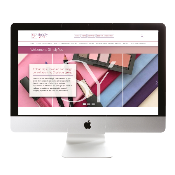
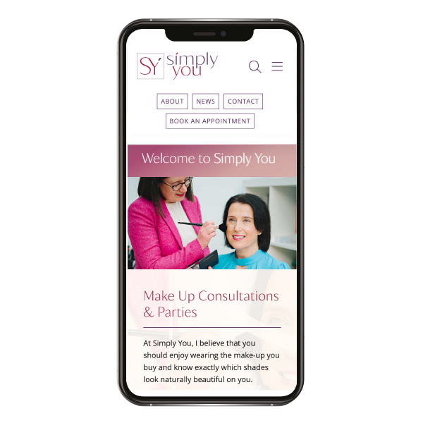
With the logo in place, the next step was to translate the simplyyou.org.uk brand identity into a fully updateable WordPress website. Savage and Gray started by defining the site’s structure and user journey. A sitemap and wireframes were created to map out the navigation flow and page layouts, focusing on delivering an intuitive and seamless user experience.
2. Design and Development:
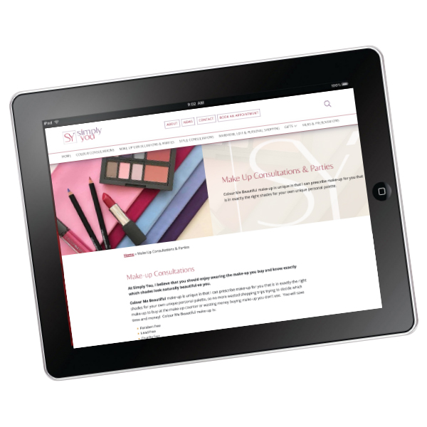
The design phase involved creating full colour walkthrough mockups that incorporated the new logo, brand colours, and typography. The website was designed with a mobile-first approach, ensuring that it would be fully responsive and accessible on all devices. Savage and Gray prioritised clean, uncluttered design elements that aligned with simplyyou.org.uk ethos of simplicity.
For the development, WordPress was chosen as the content management system (CMS) due to its flexibility and user-friendly nature. Custom themes and plugins were developed to meet the specific needs of simplyyou.org.uk.
3. Content Integration and SEO Optimisation:
Content was a crucial aspect of the website development process. Savage and Gray worked closely with SimplyYou to create engaging, on-brand content that resonated with the target audience. The website was also optimised for search engines, with a focus on keywords, meta tags, and loading speed to enhance visibility and performance.
4. Testing, Launch, and Post-Launch Support:
Before go live, the website underwent rigorous testing to ensure all elements functioned as intended. This included compatibility testing across different browsers and devices, as well as performance and security checks. After a successful launch, Savage and Gray provide ongoing support and maintenance to ensure the website continued to operate smoothly.
Simply You: A Cohesive and Engaging Brand Experience
The collaboration between simplyyou.org.uk and Savage and Gray resulted in a cohesive brand identity and a dynamic online presence that effectively communicates SimplyYou’s brand values and offerings. The new logo and website have not only enhanced the brand’s visual appeal but also improved user engagement and customer satisfaction.
By focusing on simplicity, functionality, and aesthetics, Savage and Gray delivered a digital experience that truly reflects the ethos of simplyyou.org.uk, setting the foundation for future growth and success.
